It's true. I really only like New Mexico and Maryland's. Other than, of course, Texas' -- which is the most iconic and badass.
I didn't actually think any of this was funny -- I should add a "serious" tag. It's totally true that nearly every state flag should be tossed.


Most of them are bad flags, but not for the reasons listed. Here's a nice episode of the podcast 99% Invisible on this topic (and also a summarized article, if you don't want to listen). Essentially the principles of a good flag design are: 1. Keep it simple 2. Use meaningful symbolism 3. Use two to three basic colors 4. No lettering or seals of any kind. 5. Be distinctive
My rule of thumb is that you should be able to replicate the flag from memory as well.
I'm just gonna put this out here. They're not all brilliant but they're miles ahead of what you've got over there.
Ours. They are much more flag-gy than the US ones. Theirs look much more like seals, not flags.
Texas took the United States icons, patterns, and colors, simplified them as a message, and is thus visually iconic. And damnit, Chile, you may have had a remarkably similar design a couple decades before Texas did it, but.. this is Texas. My favorite flag in the world is Libya's. It's green. It's just green (Edit: or at least it used to be, a few years ago). For "green week", in Kindergarten, my teacher refused to write "the flag of Libya" on the chalkboard, amongst "frogs", "grass", and "money". She didn't believe me. It was a bad day for me. And that's how I'd like to start my point. All flags with small-scale details, be it pictoral illustrations or micro-font have no place as a visual symbol. Arizona and Colorado, I can live with. I know their likenesses, because they're easy to associate with, due in part to their simplicity. Florida's ridiculous detail takes the cake, and Delaware's small seafoam-green text in the front and center may be the second worst, but it's hard to rank against Kansas's riverboat, which might fool the brain into thinking it's a hole in the flag's canvas. These things should be flying high in the breeze, not in 1080p on a static display, right?
waaaat https://upload.wikimedia.org/wikipedia/commons/4/46/Flag_of_Colorado.svg
Colorado is great! It's a big C, because Coloradans are Practical. C stands for praCtiCal. https://upload.wikimedia.org/wikipedia/commons/0/01/Flag_of_California.svg
Cali is great. THAT IS A BEAR. I want to see some sort of animation where all the good state flags interact like the paintings in Harry Potter. Dang, I'm looking at all the state flags now and the ones for the northeast are all pretty great. I'd like to attend a party full of all the humans and animals depicted on state flags. New York's flag has a ton of great stuff going on. It's really busy, just like the city. A blindfolded woman wielding a sword. Another woman with a wizard hat on the end of a staff, and a crown on the ground because she just killed a King. The sun has a face over the Hudson River, an eagle perches on the entire Earth, and we are reminded by a flowing banner that NY is the Best State: EXCELSIOR.
EXCEPT MINE, BITCHES! Specifically because it breaks all the rules of vexillology and does it well. It's not simple or easy to draw at all, the colors are wild, and more than three, but it is distinctive, and has meaning to the state. It's a perfect example of how to break the rules. And we fucking love it here.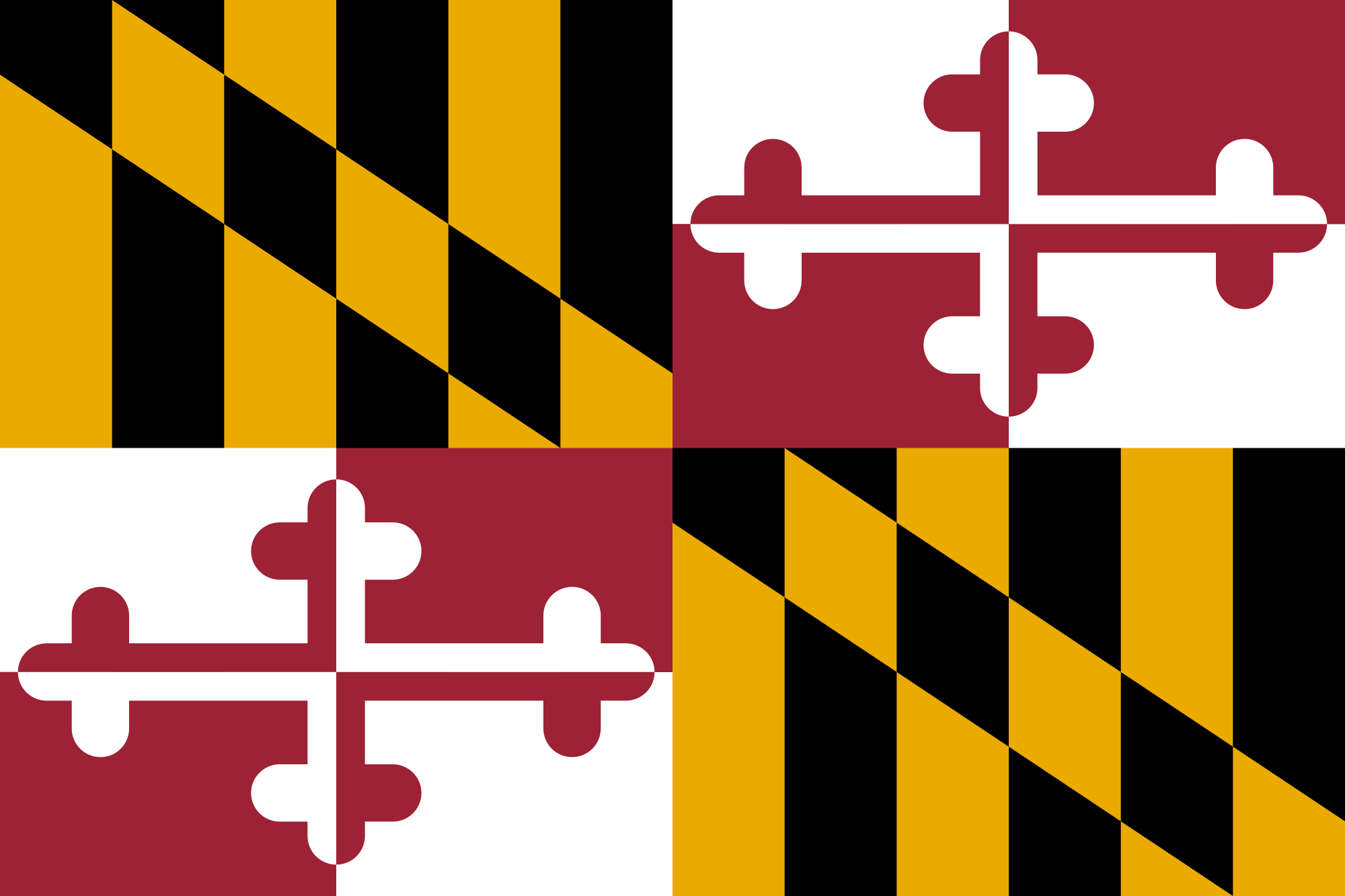
I remember my mother getting this flag to hang from our home in Baltimore and thinking from a young age, Damn, that flag is so cool. The thought holds to this day.
Haha that's awesome! I would agree though simultaneously admit that my sample size for state pride is too small to be definitive. But I love my Bohs and O's, I'm glad you're a fan too.
There is a great TED talk on flag design that is really worth a watch.

"Wrong"? No, they aren't. Bad flags, very often, unfitting to the vexilological rules, certainly, but not wrong. The title smells of clickbait. This... khm, article brings nothing to the table because it contains nothing to replace those with - or, in fact, any solution. People of the US can "toss" them, true. Then what?
Wow, the author is totally right. Most of the state flags completely suck ass. Many of them mostly just copy and paste the state seal or whatever onto a color background. Compare them with these English flags.
"Taco Bell." I'll say this - As a native son of New Mexico, I hate me some New Mexico... but the Zia is hella easy and fun to draw when you're like 7 (and as symbols go, it ain't half bad). I was actually kind of horrified when I discovered what crude pieces of shit every other state flag was... I mean, ours looks like something you'd carve on a tree but everyone else's looked like a committee of 11th graders worked clear through their pizza party. Colorado was bad and Texas was worse but once we started doing reports on other states in like 4th or 5th grade the true horrorshow kind of put us all off.Yeah, New Mexico's is great. It's simple, looks good, and captures the spirit of the state.
What's wrong with that? Looks like a fine logo to me: clean and simple. Maybe the exclamation sign is out of place, and perhaps they could pick a better font (though I have no idea which one or even which kind - something more serious, surely), but otherwise it looks rather good.
- It's just his first name. That's almost as bad as Hillary's "H" logo. - The font is childish. - The exclamation mark is childish. - The placement of 2016 (between the bottoms of the J and the !) is awkward All in all, it looks a.) un-presidential and b.) just kinda ugly.
I agree on the first one: as a President candidate, he might have made himself a service by putting his full name on the thing; I suppose it would make him more serious. Childish font? Certainly not. Serif fonts like this are used in the design and literary works, most of which I'm sure you'll agree are quite adult things. Granted, it doesn't fit there - though I must admit, I don't know Jeb Bush as a person, maybe he is a guy like that - but it's not a reason to give it a label it doesn't deserve. Same goes for the exclamation mark. It doesn't fit the seriousness - or, supposed seriousness, for all I know (I have no idea about the US elections) - and the most of such marks we can see today are in the old entertainment media, like Batman comics or movie posters. No reason to call it what it's not. 2016 is placed very well, in my unprofessional opinion. Given a sans-serif font and the right sizing, it might have a good looking at the current logo. Though, given a sans-serif font, I'd put it at a line lower than the baseline of the name, at the right corner (right under "b" in the current logo). Then again, I have no idea what kind of image does Jeb Bush put forth, so I can't judge properly - only build on abstracts. So, "un-presidential"? Probably. "Ugly", though? Obama's "HOPE" was far less good-looking than the slicker, simpler design of the Jeb Bush logo. It's not perfect, but what it's worth, it's a good start.
Heh. I didn't know it to begin with: I'm not a US citizen, let alone an American. Now that I looked at the "HOPE" poster again, I saw the little "O" symbol. I had no idea it was used for the campaign... Which gets me thinking again that canditates for presidency of the US sell themselves worse than any flashy celebrity: instead of going for admirable deeds, they wash their names in with TV ads and slogans. Jesus Christ. A good logo is very important - I know I would rather go for something with good design if I didn't care much for the rest - so I don't bash on it. It's a well-presentable symbol to go along with, though it feels bland and empty of meaning - as if name is more important than views and directions of rule.remember that in 2008
City of St. Louis' Flag is my favorite. Simple, meaningful, awesome.
”He Who Transplanted, Sustains”? If that’s what you picked, what did you reject? “He Who Mulched, Will Probably Check For Aphids”?
genius hahhah