Whenever I see pink or colorful buildings I dry up a little bit inside. There are a couple residential neighborhoods around LA full of faded pinks, yellows, blues, tans. I don't think it looks good. That said, I'm not quite sure what colors Honolulu should use. I don't think the author is implying that the skyscapers should be that colorful...right? Other options include that industrial glass & metal look...That new style where buildings have the weird colorful plastic sidings...Or a more diverse range of neutral tones? I was curious what made the buildings in Honolulu different so I went on a mission to see other places via google images: Downtown LA Chicago The biggest difference between places like Detroit, Chicago, Washington DC and places like California and Honolulu is the times that the buildings were built. On the east coast you have a lot more interesting architecture because some of the buildings were built before people even got to California. You have amazing brick buildings, art deco madness, etc. Chicago is known for it's architecture and features a lot of different tones - from black to white to dark brown to brick to beige. I guess another difference between them is that there are different tonal values of the buildings where Honolulu seems to be all the same tone.

Beautiful! Did you take that during your recent European adventure?
Not really comparing apples to apples in that BuzzFeed link. All the buildings in the really colorful cities are small wood or stucco structures--not huge sky scrapers. How much color can one inject into a concrete, steel and glass behemoth? I agree that downtown Honolulu is ugly, but almost all American cities that are West of the Mississippi are, too. But it certainly isn't color that makes Eastern cities more interesting; it's architectural detail. High rise condos are built for efficiency. Unfortunately, art is not in that equation.
How many cities have truly "colorful" architecture though? At least speaking of metropolitan skyscrapers. Really, I think color isn't the issue here so much as the styling of the buildings. If there were a bit more diversity in the geometry of the skyline it could look pretty sweet, but the architectural style there has its own history which the article mentions.
I would tend to agree that most skylines in major cities don't have much color, but rather it is the texture and the shapes of the skyline that give it its appeal. I can't think of a colorful skyline in a major city. Can you?
I've been to Honolulu once, when I was 22 years old. It was college spring break and I was certainly focusing on just about anything but the architecture. That said, I will never forget the stunning natural beauty and the way that the outdoor spaces at restaurants and nightclubs were able to integrate the natural beauty in to the common spaces. Palm trees, umbrellas, sand, water and bamboo all come quick to mind. It's such a beautiful place that my guess is that architecture has taken a back seat to geography and terroir. sounds_sound, do you know if the beige phenomenon is common to areas with great natural beauty? Have you witnessed other places where people are afraid the buildings will detract from the natural surrounding so much so that they dull the buildings down?But do the neutral tones add to the character of the city or detract from it? In the words of comedian Jon Stewart, beige "goes with everything — in an equally unsatisfying manner."
This is the "better safe than sorry" approach to design. We won't excite anyone, but we won't offend anyone either.
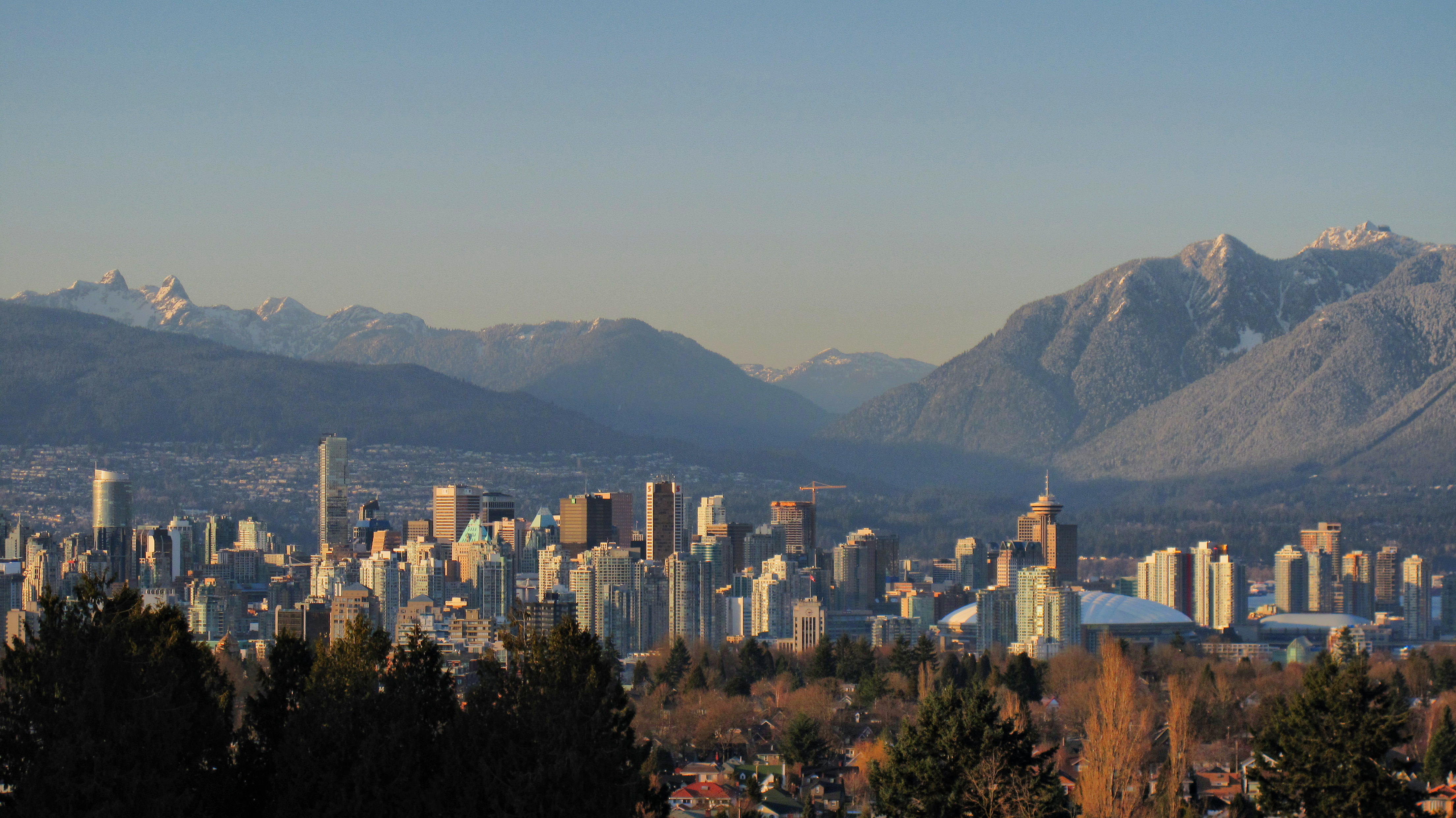
Beautiful photo, did you take it? From this vantage Vancouver doesn't appear "beige" to me in the way Honolulu does, it seems to have a lot of mirrored glass, is that right? I've never been to Vancouver. Do you think a place like Vancouver would benefit from more color or so you think it works as is?
I think most cities could benefit from a dash of color.

